Before we could announce our first video game, it occurred to me that I need to polish the UI, especially the bits that will be featured in the gameplay trailer. That’s only a part of the bare minimum that we decided to have: a gameplay trailer, game cover, and a few screenshots.
However since I started on this endeavor a few days weeks ago, though the UI has suffered quite the transformation, the end seems to be nowhere in sight! Just to illustrate my conundrum see bellow, the facelifts that the Inventory screen underwent:
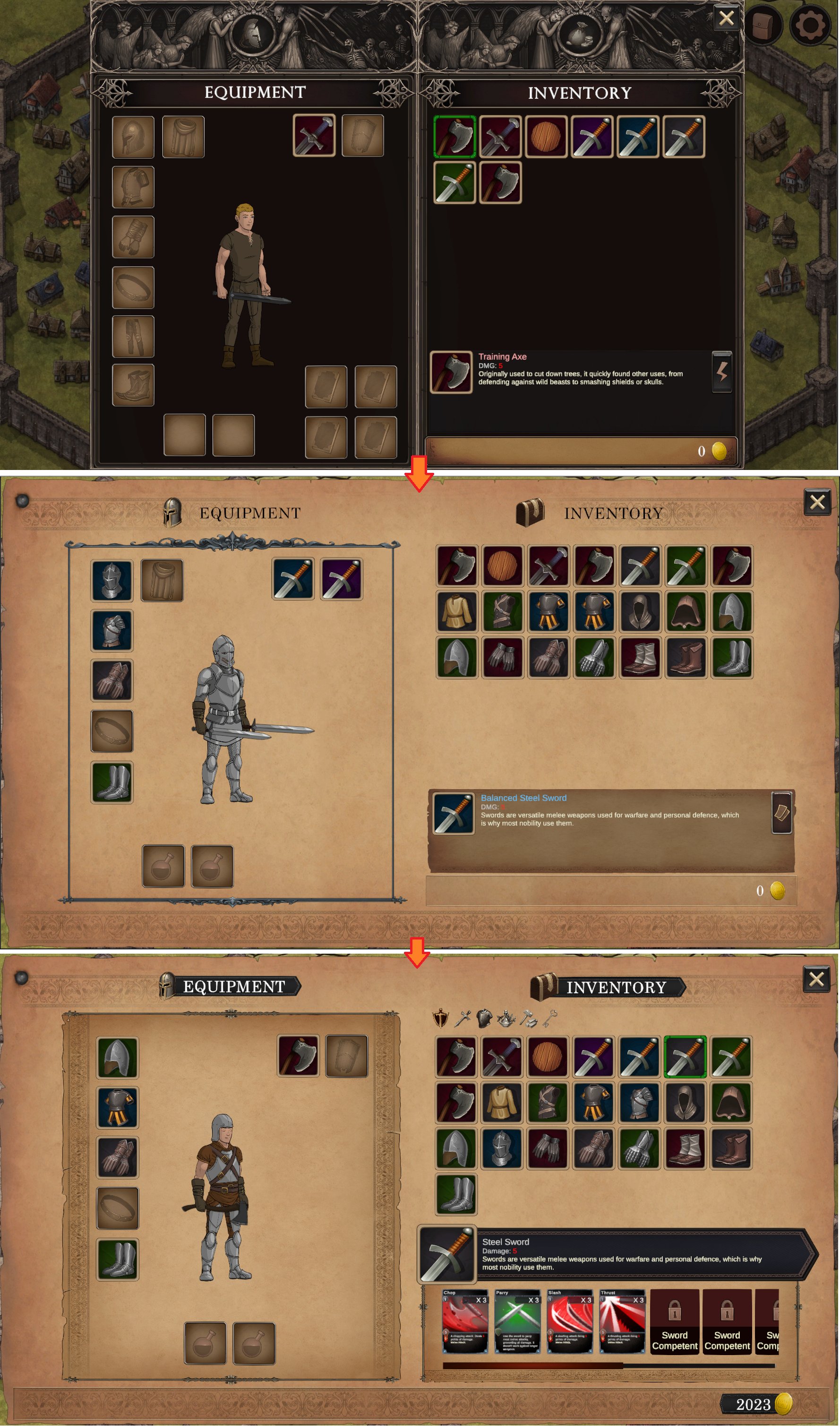
Quite the journey and it’s still not finished. I’m not particularly happy with having a horizontal scroll; to make things worse, those cards from the items in the info panel are barely visible. I will have to try out a mouse-over popup with the option to make it sticky that displays all the cards.
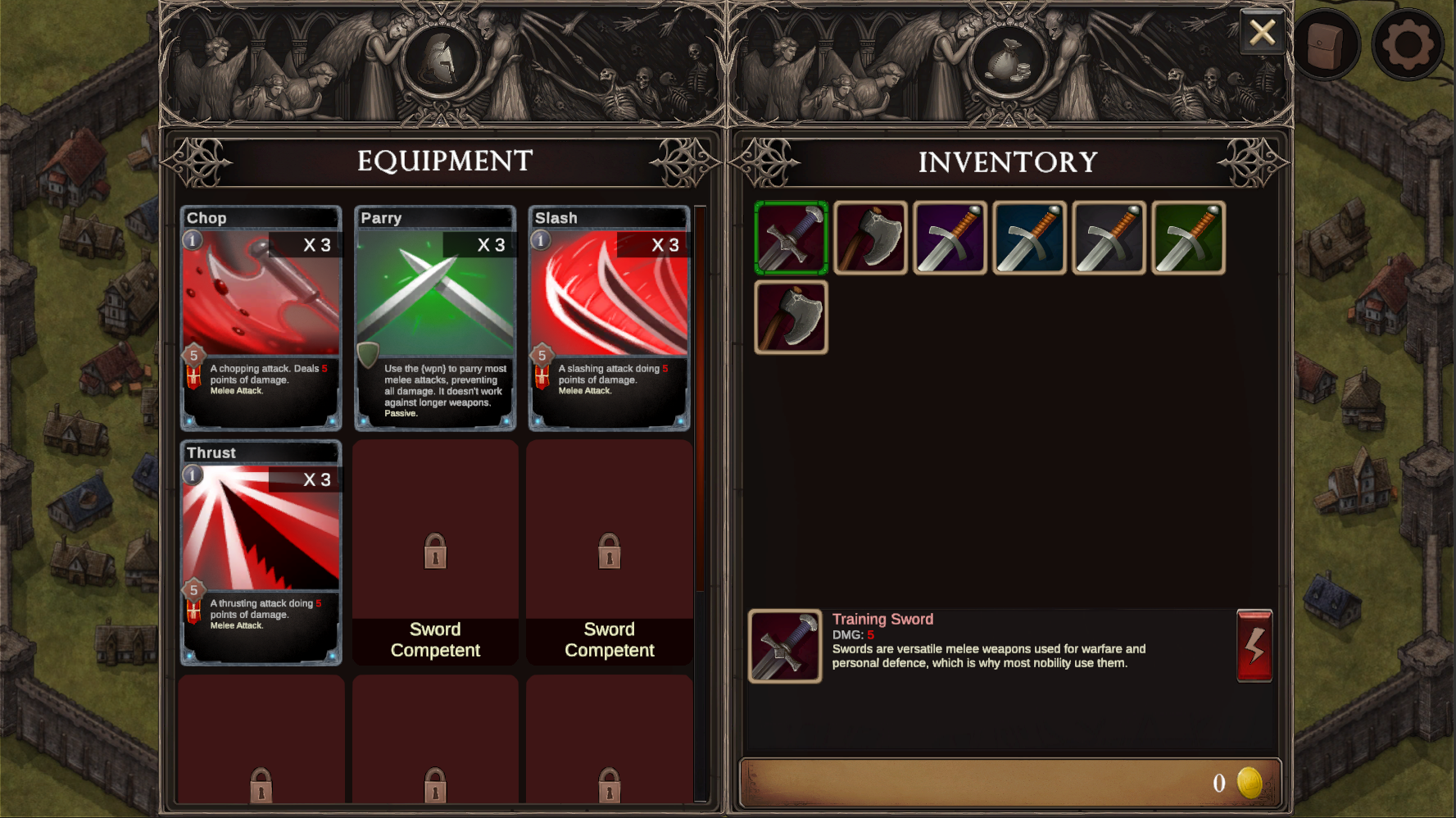
The old inventories had the option to toggle the left side, which would either display the cards on the item, or the equipment:
And since we’re on the subject of facelifts, here is the deck screen progress:
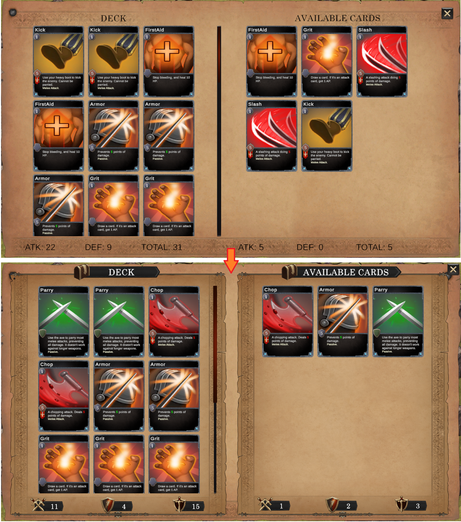
Not the most drastic of changes, but it is still pretty basic, and lacks important functionality like filtering, grouping and sorting.
Our next order of business will be to assess whether these two screens are good enough to make it into the game footage.
To be continued…